Thursday 24 March 2011
Evaluation Question 4
Who would be the audience for your media product?
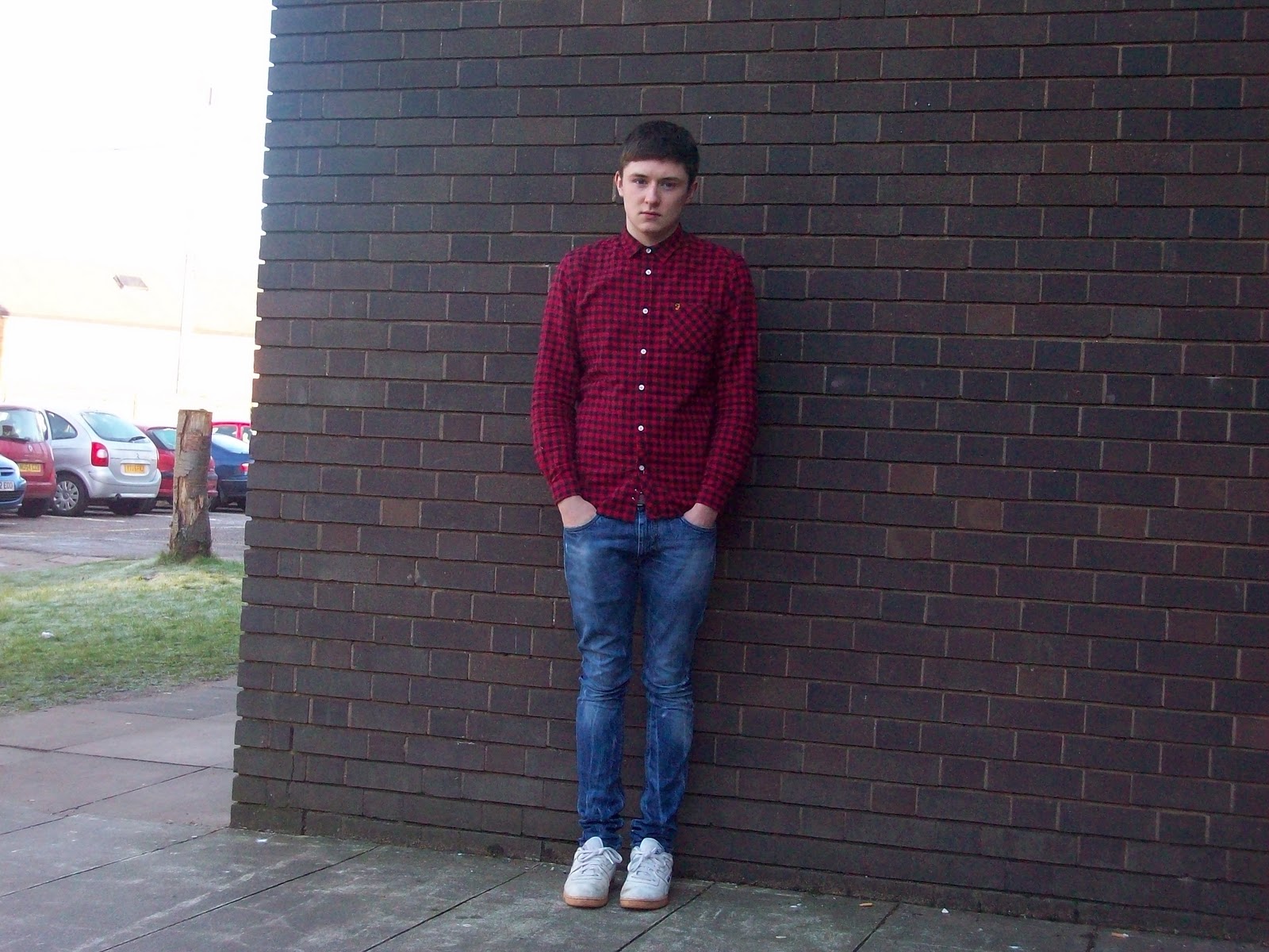
The audience of my magazine would quite often be 16+ teenagers (unless they're heavily interested in music, in which case they'd be suited to my magazine, the stereotypical appearance of somebody who’d be by magazine, you might have two differently styled people, the first being ‘guitar music indie’ and the ‘auto-tune music indie’ the latter would most probably seen out in a pair of skinny jeans, a T-Shirt or shirt bought from a shop such as ‘Size’ and on their feet would be something along the lines of Reebok Classics etc. Whereas a guitar indie would wear either skinny or slim fit jeans, bought at shop such as Levi, an ordinary T-Shirt and if wearing a polo top, it could have been bought a shop such as Fred Perry, and when needed, they would leave their house dressed in a parka/overhead, or maybe even a leather jacket, and a classic cardigan.
The people who would enjoy my magazine would people into ‘indie’ music, I believe the people who’d enjoy my magazine most would be guitar Indie fans such as The Courteeners, but my magazine would also be suitable for people who enjoy auto-tuned music such as Everything Everything. Although for people who listen to RnB or garage etc. would probably pick my magazine up from a shop shelf and feel the need to buy it.
When talking TV shows, fans of my magazines would most probably enjoy television programmes such as Gavin and Stacey and The Mighty Boosh, this would be because, figures such as James Corden and Noel Fielding would be popular amongst readers of my magazine. Plus films that readers of my magazine would enjoy, would be films such as This is England and Quadophenia, and this would be because readers of my magazine would be able to relate to characters in films such as these, and understand the emotions they through, plus to a certain extent enjoy the concept and storylines of these films.

Evaluation Question 2
How does your media product represent particular social groups?
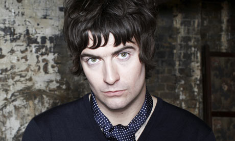
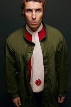
The man of the left hand side of the page, Liam Fray from 'Cult' The Courteeners, and on the right, Liam Gallagher, front man of iconic Oasis. Both of these men have a large influence over Renaissance in two, the image of the band, and by the music they create, but Renaissance by no means copy them. One noticeable thing about the appearance of the three men is the scarf, all three of these men are wearing the scarfs under the influence of the Mod culture, this influence in Mod culture could be represented through the music that these men create, showing a similarity in all of these men. This could also pragmatically imply that the men are all inspired by the same people, and they all take influence from the way these the 3 three Liam's style themselves.
Although there are also differences in Fray, Gallagher and Lennon as well, yes you can tell straight away by looking at them that they dress in a similar way, but there are also differences to the way that they dress as well. Liam does not go around in a parka jacket whereas Gallagher and Lennon do, and Fray and Lennon have longer darker hair, whereas Lennon have short blonde hair, this could pragmatically imply Lennon is unique and diverse to others.
Finally I believe the one thing that remains clear, and this that all three musicians have been inspired by culture, and take a high amount of inspiration from culture, whilst still bringing something fresh and new to their image, which could inspire others in the future.
Evaluation Question 3
This also helps to explain the reason why I didn't use 'IPC Media' because they already publish NME magazine and NME would include similar articles to my magazine, therefore IPC media might put more effort into NME magazine rather than mine and therefore giving it a better promotion so my magazine wouldn't sell as many copies. So because my magazine would be with 'Bauer' more expense would be put into publishing my magazine my magazine. So it might be able to rival NME in the indie/alternative magazine genre.
As this is the first issue of my magazine, I would have to attempt to distribute my magazien very well, this is because people might not be familiar with my magaizne therefore they may decide to NME which is a magazine they would most probably already know, just to be on the safe side, as NME have a reputation for producing good quality magazines with interesting content.
Also, to advertise my magazine I would have to use tradional ways of advertising my magazine, ideas such as having posters planted in the street, whether or not they may put in stereotypical places such as bus stops. If possible I could try to create a small advert to promote the magazines first issue, although this could quite difficult considering, I might not be able to spend the budget for the whole first issue by creating a magazine, and publishing it on televison. I would attempt to perdsuade who're on included in the first issue, to tell their fans to buy the magazine, by distributing the advertisement through their websites and Twitter ETC.
Although my promote 'Vinyl's' first issue, I may also have to use some 'below the line' strategies to promote the magazine, such as trying to promote my magazine, through social networking sites e.g. facebook, in the side bar, so hopefully it will catch users eyes as they're on these sites, and influence their decison to buy the magaizne in a postive way.
Also when looking at where I will distribute my magazine too, to sell, I would hopefully sell my magaizne in supermarkets such as Morrisons and Asda, this is because when people go to do their shopping, they may walk down the isle where 'Vinyl' is placed and decide to buy the magazine. I would try to sell my magazine in small newsagent, this is because newsagents are a place where many magazines are sold, so somebody may walk into the newsagent, and accidently come across my magazine, see the front cover and decide to my magazine looks very interesting, and decide to make a purchase. Also after if the first few issues are a success then I would plan to offer a subscription, over 'Vinyl's' website, so I would make the customers a fee upfront, so that if they did an a 1 year subscription, then I would already have their payment, so I would be making moeny out of this procedure, and to promote subscription I would charge a yearly fee so customers would be saving an estimate of £15 per year through subscription, rather than buying the magazine monthly via a shop.
These are methods I would use to try and advertise and distribute 'Vinyl' magazine whilst not going over the budget, and also hopefully making a profit.
Wednesday 23 March 2011
Evaluation Task 1 Final
1. In what ways does your media product use, develop or challenge forms and conventions of real media products? (i.e. of music magazines)


The title of the magazine
Graphology/page layouts
Costumes, props, iconography used to reflect genre
Camerawork and framing of images
Title, article, header etc font and style
Genre and how the magazine cover, contents and spread suggests it
How your artist(s) are represented
Colour scheme
Above is an image of a Q magazine, when looking and comparing this to the magazine that I created, you can see some noticeable similarities and differences. The main similarity of the magazines is the masthead, they both consist of having a square box with 'Q' inside for this magazine and 'V' on my magazine. I did not set out to copy this masthead but I believe that I had the same view and imagery ideas as Q. After experimenting with a red 'V' and a white 'V' inside a red box, I concluded to find that the latter stood out more, and looked more aesthetically pleasing, because without the box surrounding the 'V' it looked slightly plain and generic. So I believe having the masthead inside the box, gave the magazine more promise of selling on the shop windows. We also both have one letter as the masthead, this is because people would know what magazine they're buying by just seeing one letter, so by using the first letter, I am not blocking up the page with unneeded features which would help sell the magazine.
My magazine differs from Q magazine in the fact that my magazine has it's issues special features based on the left hand side of the page, whereas Q magazine has it's features and plugs listed down both the left and right hand side of the page. I belive this was done due to the size of the cover image, my image is bigger than Q's image, therefore if it was avoidable, I didn't want my plugs and cover features to hide the cover image too much.
Also this magazines cover star (Liam Gallagher) has a lot of influence on my cover star, they both make similar music, the indie genre and also they both have a similar dress style, although on this particular image the dress does look mildly different, but in that the both these cover images are set out I believe it's fair to say you could suggest that 'Renaissance' could go on to have the success that Liam Gallagher had with Oasis.
The title of the magazine 'Vinyl' suggests that my magazine will have articles and features based around music from different generations, since Vinyl's have been involved in many generations and today seen as quite a cultual and iconic item which is a value I'd quite like my magazine to have in the future. This differs in Q's name because they take inspiration for their name from the verb, 'to cue' a record, when you are about to buy it. So my name is based upon the the impact and meaning that the magazine would have to people. Rather than Q magazine, who base the title on their magazine, from when you cue a record as you play it.
I believe the genre of my magazine (Indie) can be represented, by seeing the cover image, because straight away you you can tell what sort of music this man is going to create, because he doesn't not fit the typical bill for somebody from a Hip Hop scene. Also by looking at the bands recognised on the front cover you can this Indie genre will be running throughout the magazine, therefore making it a definite buy Indie, whereas you have accept that Hip Hop or Garage fans etc. would not be intrigued to buy this magazine. Also straight away from reading the article on the double page spread you can tell Liam Lennon is an individual who makes the music he likes, and is independent, also you can that fans of Hip Hop won't be very interested in his article whereas Indie may read heavily into the article, and I belive that he speaks on behalf of the Indie genre and agrees that they need more artists coming through, and is infact a good ambassador for the Indie genre of music.
The artist on my front cover, Liam Lennon from the band Renaissance, is represented as your typical frontman man of an Indie, he volumes of arrogance but also intelligence, although the crucial thing about Lennon, is that he is one of a dying breed, and music that Lennon creates, proper guitar riffed music, has fallen out of place, but now Lennon is on the scene, he is considered as the last hope to keep Vinyls opinion of 'real' music alive, and maybe go on to become one of musics icons for future generations.
Finally the colour scheme of my magazine is red, white and black, predominantly with the main writing texts in black, the backgrounds being white and red was often used to border the fonts, or if not to stand the writning stand out, with exception to the 'Renaissance' banners. This follows the same convention as Q magazine, and the reason for this is because I believe the colours work well together, they do not contrast badly, nor do they overshadow each other. Also I was aware of the similarities that my colour scheme had to Q magazine, but when I substituted the red for other colours, it didn't have the same impact, and i believed that by having red as part of the colour scheme it increased the chances of selling from shop shelves, therefore I kept red as part of the colour scheme.
Subscribe to:
Posts (Atom)